A certain legion of Doctor Who fans has been incensed by the New Series exterior TARDIS prop. Mind, not the interior set — the outer police box prop. The most common complaint is the size. It’s “too big”, people say. Actually, more like: “it’s huge!” Another issue is that the bevelling on the panels isn’t exactly right. Then there’s the aspect that it’s “just horrible” — or, in the Klingon slang UK Internetters speak, “naff”.
One fan was so irritated that he decided to build his own “proper” prop to assuage himself. Fan reaction was unanimous, from what I could see. This was a proper TARDIS, all right. It’s what the New Series prop should have been all along, damn that Russel T. Davies.
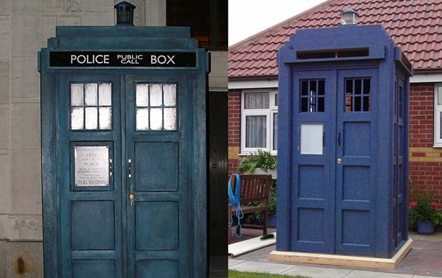
Just for the fun of it, let’s see how they compare. The New Series prop is on the left, the incomplete fan prop on the right.

Note that the fan prop is incomplete. No signs, and not fully painted yet. Still, you get the idea.
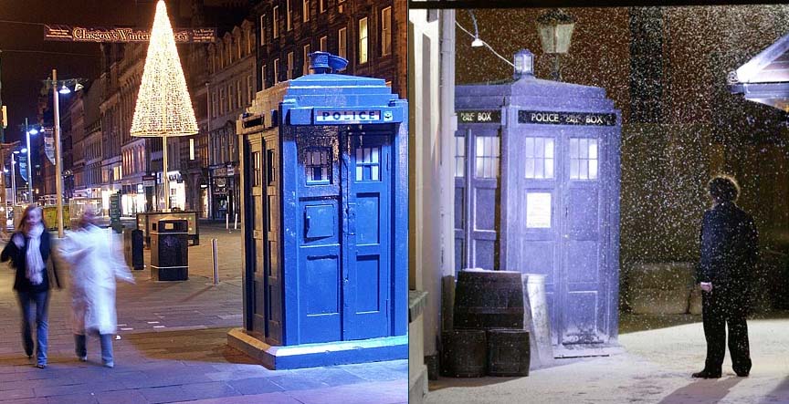
Spot the changes? Smaller windows, smaller space up top for the “Police Box” banner. Those are the major ones. The guy who constructed it admitted that he made the windows narrower intentionally, on a personal whim. Also note that the guy made it to scale of an actual police box, and found that it was the same size as the New Series prop. You can see for yourself how big it is, in the picture. As for the New Series box:

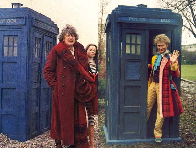
Actual police box (slightly older model) on the left. Notice the scale. Now compare to the John Nathan-Turner box, from the 1980s:

Also Note the amount of horizontal space given to the “Police Box” sign. There goes that detail.
Of course, the 1980s box is well-known to be larger and more “accurate” than the original TARDIS prop.

…
So. Let’s talk about gamers, shall we? Say… fighting game fans?