To catch up on the story to date, you can view the archive here.
There are at least three ways to give up. You can dial down your ambition and just putter. You can change plans and try something different. Or, you can just stop.
By the end of my Game-Maker tenure I had shaken free of some of my more rigid ideas, and thanks to a few high-intensity bores I had learned not to invest more of myself into a project than I got back from the buzz of creation.
Indeed it seemed like my best work came when I had no investment at all. The more motivated I felt to complete a project, the more narrow I found my thinking. When I was focused on a goal I would pay little attention to a game’s moment-to-moment dynamics, to the player’s role, to whether or not a design element actually worked, or more generally to whether or not the game was fun or rewarding to play.
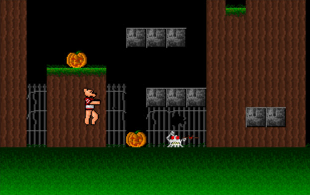
I would rush the visuals and level design just so I could call them done and move ahead. When I added content, it stayed in because it would take too long to edit it out. Anyway, more is better! What’s the point of working backwards?
With focus came an obsession with doing things “right” — which at that time meant imitating something familiar to me, usually an existing game that I enjoyed. I figured if I wanted to be taken seriously I had to produce a recognizable game; one as good as the competition’s.

Then, sometimes, I gave up — and freed from the confines of reason, my subconscious came out to assert itself.
This final chapter is about giving up. We touched on this in the previous chapter, when after the ambition of games like Ninja Tuck and A-J 3 I chose to back away from Game-Maker, at least from serious attention, until some of my concerns were addressed and I had a grander tool set to match my inflated plans. That update never came — and during the long wait my attention shifted to the small things, like controls and level design.
That snit was hardly new. I went in and out of these moods. In a sense they shaped my design career. For a few months I would plug away at a pattern that seemed to work; then I would realize that it didn’t quite. I would burn out, and then manage my discouragement by changing the tune. I would toy with something different — something silly, for which I had no real expectations. And what do you know, in hindsight these were the games that really mattered.
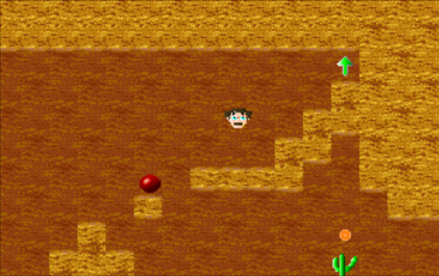
The games that we will discuss here are the oddball projects that do something a little different from what I knew at the time. These are the turning points — when I gave up, when I let go, and when I grew a little bit as a designer.
The pattern began way back, just a few months into my work. With A-J’s Quest I had produced the game that I bought Game-Maker to produce. It wasn’t perfect, but it was good enough. My goals completed, I set out to milk my purchase by showing it off to my friends. In the process I hit several walls. I had some very specific ideas, and I couldn’t find a way to implement them. I felt stuck, and could see no way out besides waiting for improvements to the game engine — so my attention drifted.

I fell back to Deluxe Paint, a program that I felt I had mastered and that had carried my attention since middle school. At that time I had a stockpile of images and brushes; I knew all about palette cycling and gradients. Unlike Game-Maker I felt no boundaries there.
With my mind on drawing, at last I noticed RSD’s Graphics Image Reader, a tool for importing .GIF images and palettes into RSD’s own formats. To that point I had ignored it, as RSD’s drawing tools were good enough and I wasn’t really up on image file formats.

Around here, though, I discovered the modem on my father’s 286. Day after day I would dial up local boards and explore their download directories. I found image management tools like Graphics Workshop (sort of the Adobe Lightroom of its day), and I found extensive libraries of 320×200, 256-color .GIF files. Some of them were even photographs — and such clear ones, at that!
I began to convert my own Deluxe Paint illustrations to .GIF files, to upload them for board credits. While I was at it I tinkered with RSD’s importing tools. There are a couple of ways I could have tackled this. What I wound up doing was adapting my Deluxe Paint brushes into Game-Maker sprites. When it seemed workable, I would rescale one of my larger drawings and turn it into its own sprite.

Parallel to this, I got my first sound card — a new Sound Blaster Pro. It came with a rather clean, user-friendly tool for recording Creative’s proprietary .VOC format, which happened to coincide both with the demands of RSD’s engine and with the format of online sound libraries. So while I filled my junk drawer with random externally derived sprites, I also built up an archive of random audio samples. Some of them were original; some derived or taken from online libraries.
After a few months these archives achieved a sort of a critical mass, and I figured it was time to either make use of them or to move on to other projects. Thus the brushes became monsters and the samples became a sound set. Groucho Marx, pushpins, sugared cake doughnuts, and biplanes were ready to terrorize a minimal-effort landscape. To create the levels, really I just drew two tiles — a foreground and a background — and then blurred a few edges between the two.
That just left the matter of a protagonist.

During all of that .GIF importing, I experimented with a few downloaded or demonstration images. One in particular, a slightly terrifying close-up of a clown face, became a focal point. I tried to import it and chop it into tiles. That didn’t work. I tried to shrink it down into a 20×20 sprite. The result was… strange. So I compromised; rather than importing the whole image, I picked a key feature — the clown’s red, shiny nose.
With a bit of editing, I had what I felt was a photo-realistic bouncy ball. For no sane reason I also selectively imported the clown’s eye, and animated a sequence where the nose turned into that eye.

Add in a few laser effects, assign the random sound samples to in-game actions, write a bizarre narrative justification for the proceedings, and we have The Bounerim.
For all its random origins The Bounerim is the project where I began to understand 2D platformer design. After A-J’s Quest and its more-of-the-same sequel it was my third attempt at a the genre — but those were a special case, designed in my head years before I had the tools to produce them. The Bounerim demanded that I think through the genre’s mechanics and implement them anew, and more than A-J’s Quest it established the style and techniques that I would use in all of my later games.

Of those, the most direct descendant would probably be Crullo. It’s got similar mechanics and a similar kind of a protagonist (based on the same brush used for one of Bounerim‘s monsters). On another level, Crullo is the first time that I really used Deluxe Paint as a primary tool for background and sprite design — whereas The Bounerim is the game that set that ball rolling. As it were.
Of course use then turned to overuse. For me Deluxe Paint became a shortcut, which set a precedent for all my working habits. At the time it seemed like a gift. This was an intense period; I had only a month to plan, build, and deliver six games and sundry resources. It was tough to focus. Each game was meant to show some aspect of RSD’s engine. One would play with monster types; another, styles of background block. In the end I was distracted by scale and glitz, and spent my time on showcase games that failed to live up to their goals.
Had I more time, or had I better used what I had, I had more and better plans than the ones that came to bear. The best of those harked back to my first glimpse of RSD’s software, in those ads in the back of VideoGames & Computer Entertainment.
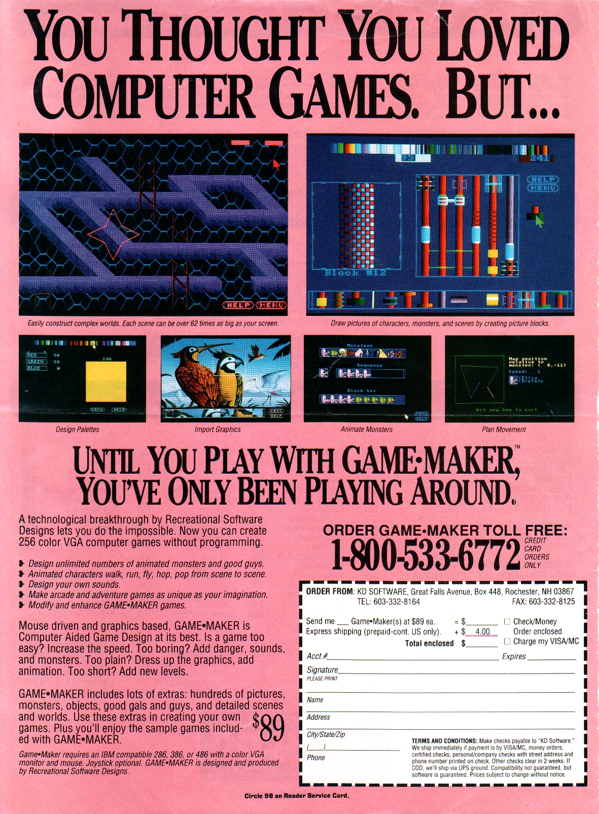
I’ve talked of how those shots caused my mind to race. They spoke of magic and variety, like a trip to the arcade or the front desk at Kay-Bee Toys, or a new disk in the mail filled with unknown surprises. In particular the image of Block Designer, its sandbox window filled with tiles from G. Oliver Stone’s Pipemare, called to mind radically diverse games like Tower Toppler, Alleycat, and Arkanoid — none of which, as it turns out, Game-Maker was meant to replicate.
Still that hypothetical game stayed with me — something involving towers and bridges and inscrutable barriers. It was a vertiginous thing where the player passed in front of and behind objects, collected power-ups, and found the best and safest route skyward. The game had never existed, and yet I found it indelibly linked with Game-Maker. If I were to produce demo games, I could do worse than to fill that blank.
All through the summer that game danced across my mind yet never quite landed. It would be something to do with poles and gravity — leaping or climbing from pole to pole, as on a giant jungle gym. Scattered around the poles would be obstacles, threats, and bonuses. The pieces never meshed, and there was always something else to do. Then came the deadline, and in the following burn-out any spare ideas just melted away.

There followed a long period of inactivity. I went back to school; I started to make friends and do things. I began to listen to music, and to try to write my own. By the next spring my mind was rested — so when I approached Game-Maker, I did so from a new angle.
I started again. The previous summer I had tasked myself to break down Game-Maker into its constituent elements, so as to show off its properties. That notion returned with a new clarity, and I went back to basics. My new game would simply explore the engine’s physics. Gravity could go up or down, or it could be static. Tiles could be solid or not, on various sides. They could injure or heal; increase or decrease counters. They could animate, and change on contact with the player. These would be my limitations; rather than fight against the engine’s boundaries, I would demonstrate its features.
I drew every tile by hand, in RSD’s own tools. Although I used Deluxe Paint for the menus and splash screens, I restrained myself to just a few colors, simple geometry, and a consistent shading technique. Every element was new, every piece was simple, and every part of the game served to illustrate the basic concepts at its core. The result was an action puzzler called Friction, which — some quirks aside — may also be the finest game to rise from my Game-Maker career.

As I focused on the background physics, I focused on the environment. As I took pains to clearly demonstrate the physics, it happened that I found a sense of level design. For possibly the first time I agonized over a game’s maps. Each tile had to be placed just right, and to stretch out and highlight the fairly limited palette of concepts I had to introduce them carefully, one at a time.
Whereas most of my games had been object-oriented — they were about the character, or about mimicking a game that I liked — Friction was all about the subject. The story, the character, the visuals all served the game’s central purpose as extrapolated and narrated by the level design. Since I had extrapolated that purpose from the engine rather than imposed it upon Game-Maker, I also hit fewer of the engine’s limitations — meaning those limits showed less clearly. By embracing the given boundaries, Friction is one of my few games not to feel defined by them. In that sense I would consider it my first mature design.

It had its problems, of course. Even with all of my concessions I felt that the engine did not want to work with me. Due to issues with the physics and certain “features” like the helpful way that characters bump their way around corners, I had trouble keeping the character aligned with the ropes and poles. I also hit the Pac problem: due to the engine’s persistent counters, if the player picks up a key and then dies then he begins his next life with that counter still increased.
Thus puzzles are never truly reset, and the player can easily bank items for later use. In retrospect I suppose I could have placed a tile at the start of each level that drained any artificially raised counters — but I was not yet at that level of hackery. I was still approaching the engine in earnest, and I expected features to work as proscribed.

The game has a story, though it is of no consequence. I figured that anyone who would be inclined to acrobatically leap around on ropes and poles would be something of a daredevil; this brought to mind an old whimsy stemming from a DOS-based brainstorming and poetry generation suite, Rosemary K. West’s Thunder Thought and Versifier.
Basically this software called from a huge database of nouns, verbs, adjectives, and phrases. The user would choose a template and set a few variables; the software would randomly fill in the structure with content from the database. When I got the software I scrubbed the databases and then entered the bare minimum of my own content — which meant that the same words and phrases tended to recur with some regularity. One of the first proper nouns that I entered, which quickly became a joke, was a reference to a genial hot dog vendor in my home town. Through poem after poem, “Hank the Hot Dogger” went on wild adventures and learned deep life lessons. On the basis of his name, I figured he would make a good protagonist here.

By this point in my design career I was big on customization. If I was going to make something, I figured I might as well use all original elements. Whether they were any good or not, at least they were my own. Accordingly I recorded and edited all new sound effects which would have a long life in future Game-Maker projects, well beyond my tenure. I’ve lost count of how often I’ve heard the grunts and chomp sounds reused in other users’ games.
The only thing left to customize was the music. I’ve talked about this before, but here’s a missing chapter in the tale. Since its introduction to Game-Maker I had been frustrated with the Creative Music Format that RSD’s engine supported. As I now understand it, RSD had grander plans for music but Creative’s code was ready to hand so with a deadline at their heels they slapped it in to provide at least provisional support.
That would have been fine, as from an aural perspective CMF is a perfectly respectable format. It’s a sequenced format, like MIDI, that uses the Sound Blaster’s Yamaha FM chip — a close cousin to the chip in the Sega Genesis, one of my favorite sound chips in any game console. The problem is the lack of any obvious compositional tools. This means that nearly every Game-Maker game draws from a small pool of library tracks, in particular the six tunes that shipped with Game-Maker and the scores to several early Epic Megagames releases.

There were tools available, as I would later discover — some more practical than others — but the support wasn’t what it could be. Furthermore by the time I lost patience with the situation, other better music formats had become prevalent. Later Epic Megagames releases used Amiga-style module formats, which sounded great and were simple to compose. With Friction I felt I had played fair and mastered every aspect of RSD’s engine. I had created something totally new and original within the given boundaries. The time was up: I wanted to finish the job, and write the music. I had been playing with Scream Tracker; I felt I could do a decent job. I was ready. Where was the feature?
Thus began my nagging, which RSD must have loved as it was constant. And thus began the spiral into my fabled “strike” from design — a decision with no immediate and obvious benefit to anyone.
Zoom ahead a year or so, to that fabled strike. Feeling that a new version of the software was around the corner, my ambitions inflated and my sense of design suffered. Confident in my mastery of RSD’s engine I began several big projects to impress my new friends and acquaintances, expecting that by the time I was finished I would have access to the expanded features that I wanted. That never happened, and I grew frustrated. I sort of figured out how to hack some awful sounding music into a game or two, but the solution wasn’t really tenable. Basically I gave up until I felt the canvas was large and variegated enough for my new level of mastery.
That didn’t mean I stopped designing, though there were some large gaps. It just meant that I did little more than sketch. Since the tools wouldn’t scale to the schemes in my head, again I scaled my schemes to the tools at hand. Games like Watch Me Die! built on my breakthroughs with Friction; all game elements served the level design, where I focused the bulk of my attention.
As I worked on Watch Me Die! I realized that my well was drying up. In search for inspiration I slunk around some local bulletin boards to appeal for suggestions. A fellow by the name of “Gremlin” suggested that I throw together a quick game featuring his namesake. I told him I would be back in an hour or two, and I set to work.

With a mind to my limited development time, and perhaps as self-conscious commentary on my level of burn-out and apathy, I began by drawing a stick figure. That in turn led me to subvert expectation by animating the figure as fluidly and precisely as I could. Along a similar thread, I gave him an enormous bazooka — because he’s a stick man; where could he hide it? I then drew a handful of background tiles, and built a small map around the character’s exact movements.
To fulfill the game’s remit I threw together a boss monster, inspired to no small extent by Bowser from the original Super Mario Bros.; then to add interest and to give the player something else to shoot at I added some destructible crates. Shoot a crate, and its shards fall downward to destroy everything beneath. Shoot the gremlin several times and it would drop a key, allowing egress from the stage.

That was the game; Beware the Gremlin, I called it. It was self-consciously the simplest thing I had ever designed. It was also perhaps the most elegant and functional. Every element supported everything else. There was nothing extraneous, there was nothing confusing, and unlike Friction everything worked exactly as it should have. The game did what it promised to do, and then with comic understatement it was over.
For the last time in over 15 years I tacked on my A-J Games logo. Just to be obscure I added a secret level; then I uploaded it to the BBS. My client, if that’s what we can call him, was disconcerted. He hadn’t expected for the player to kill the gremlin. He sent me a conflicted thank-you, and I think that may be the last I heard from him.
Although this was the end of A-J Games, it was not quite the end for me.

Skip forward a year. On a whim I exhumed Game-Maker from deep in my directory structure, and began to hack at some graphics. If I was going to dig up my old tools, I wanted to do something different — something more refined. I decided to forego the gradient fills, and do the art by hand as far as I could. The backgrounds would be simple, and more or less monochromatic. The highlights felt natural, and honest in a way my pixel work hadn’t in ages. A few things I did export to Deluxe Paint, to touch up with transparencies or other effects lacking in Game-Maker’s tools, but I tried to be subtle. I wanted atmosphere, and I felt I couldn’t just manufacture that.
At one point the fellow who ran KD Software, the company that distributed Game-Maker and handled some of the packaging duties, scanned and assembled a bunch of Eadweard Muybridge’s motion photographs, to piece together a sprite of a silvery naked lady. He then tinted the frames to give her a bathing suit, and inserted her into a couple of demo games. For some reason that sprite called to me, and I edited it to suit my design. A female protagonist — that’s what I had been missing. My only others were in abandoned and exploitative projects like Dusk Rose.

My head full of promise, I began to get ahead of myself. I wrote a long, tortuous story and began to render a few short cutscenes. I didn’t have the right tools, so I drew and exported them frame-by-frame and used a command line utility to bundle the frames together. It was a process of trial and error, and I was impatient, so I aimed low.
With an eye to some B-movie classics, this game became (Did I Ever Tell You About the Time I Was) Taken by a Vampire One Night. Yes, well.
As the title suggests I wanted to create was something in the vein of Castlevania — by which I mean the aesthetic, more than the mechanic. Granted, this was in the days before Koji Igarashi, so when I say Castlevania I mean whips, forward momentum, and deathly difficulty — and when I say aesthetic I mean that danger and energy every bit as much as the dark halls and creaky doors.
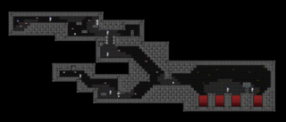
Although I later mastered the trick, at that time I could find no way to replicate the whip animation. Melee attacks are always tricky with this engine, even if you know what you’re doing. So instead — as with The McKenna Chronicles — I looked back to the stone-throwing of Dark Castle. It seemed a natural enough leap. This time I went for playability over cleverness, and had the stones fly straight until they hit something. I made the character jump a precise height and distance, and then developed levels around her. I made the levels short, and tried to introduce one new thing in each. I produced a final confrontation, and in a early version I included a Streets of Rage style text prompt that allowed for multiple endings.
And you know… the game wasn’t half-bad. Some glitches aside, it actually played well. It might have played better than any game I had made before. The character moved predictably, and the levels were made with some actual, practical thought. On top of that, the game was fairly attractive by my standards. Granted I couldn’t write the kind of soundtrack I wanted, the game was short, and the sprite wasn’t wholly original — but this was a pretty high water mark for me.

And then I decided to get clever after all, and I threaded the game with dumb, hidden smut. In my defense I was seventeen and I didn’t get out much. But this is where the game fell apart. Once I introduced that element, it was all that I focused on. I designed a complex branching structure to allow all of the hidden naughtiness, and then made a secret second ending for the player who managed to find and take every one of those left turns. And it was stupid, and it meant I couldn’t release the game. Not under my name. I couldn’t accept credit for it, and… shortly after I finished, I felt that I didn’t really want to, either.
I whipped up a new logo animation, and released the game for free, anonymously, under the “Really Weird Productions” banner. Then I promptly wiped it, and Game-Maker, from my memory. This was the end, for real.
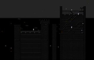
Thus ended my career as a game designer, at least for a while. My path started in dreams and sketches; notes on the margins of neglected homework assignments. Then I found a magical box, that promised me the world. Given the tools to follow through on those dreams, my ambitions soon compounded to outweigh my abilities, patience, and judgment.
At my core was a fundamental misunderstanding of game design. The point of design is not to get one over on the player. It’s not about competing with or bettering existing games. It’s not really about character or story or scenario, although they can help to make the point. The point isn’t about all of the cool features that I can cram into a game. It’s not about content. It’s not about a flashy presentation. It’s not about any of my a priori expectations, either about what a videogame is and should be, or about what I need to finish the job. The point is just to communicate an idea, as clearly as possible.
Game design is about looking at the boundaries available, and finding something interesting to explore — and then extrapolating it as far as it goes. It’s then about relating those ideas to the player through a careful dialog of rules and illustrations. Anything that doesn’t help to explain the premise is a distraction, and probably shouldn’t be there.
It took me forty games to get there, but finally, wordlessly, the pieces began to click into place. Of course by then I’d had enough. I was out of high school. I had other things to think about. Videogames had failed me and I had failed them. I was done. With a few exceptions I barely thought about them again, until the Sega Dreamcast.
Years later, I was a freelance writer. I mostly wrote about videogames, because that’s mostly what people expected from me. On one gig I was writing about indie games, and I needed an original topic. My mind turned to Game-Maker. When had I last thought of that? There was barely a word about it on the Web. So, I began to chip away. And it turned out, quirks aside, the tools were really well-designed. I wondered, were they good enough to make a contemporary game? One last game, I thought. One last try.

For a model, I looked to my previous finale. Again I drew a stick figure, and again I animated him with precision. Again I built simple levels around his movements and abilities. The more that I piled on the postmodern twists and weirdness, the more I felt the need to ground this new game in the past.
Builder was my follow-up to Beware the Gremlin! — not a narrative sequel; just its successor. I took what I felt I had done most right, and built on it. To make up for the added concepts I further stripped down the presentation, until the backgrounds were little more than flat colors. I don’t know if I was channeling Rod Humble or Berzerk (or, for that matter, Hero Core or Love+); I just knew that I didn’t want the presentation to distract from the design — and that the simpler the presentation, the more room it left for the player to fill in the blanks.
And you know, as creaky as that old engine was, with new eyes I found new life in it. Everything that was a barrier became just a property, to work with or around. All of these new ideas that I was exploring, I could have done this twenty years ago. I just couldn’t see that far in.
The limits to one’s art lie only in one’s head, and never in the tools at hand. The rougher the tools, the greater the discipline. The greater the discipline, the finer the expression. The finer the expression, the richer the art.
I may never be a great artist, but at least now I can use a simple tool. Maybe one day that will come in handy.
(Epilogue: In 2010, when I found my old games again, I took a long, hard look at Vampire. I was surprised. Strip out the idiocy, and there was a good game in there. So, I stripped out the idiocy. I tweaked a couple of rough spots. And far too late, I tacked on the original A-J Games logo. It is now a part of the canon.)