The History of A-J Games: Part Three

  • Reading time:10 mins read

To catch up on the story to date, you can read the first two parts here and here.

So some of my characters, I spun out of existing projects. Others came about from that web of interests and in-jokes that brought about my Andrew-Jonathan strip in the first place. These characters are built of wholly abstract materials, which makes it all the harder to justify them in design terms.

It would be one thing to base a game on abstract concepts. That’s probably an ideal place to begin, actually; to take vague notions from life and to see how best to communicate those ideas through a framework of cause and effect. You only seldom see this approach; when you do, as in games like Passage or D2, or even Pac-Man, you end up with highly expressive, meaningful content.

Pac-Man

To base a game not on concepts, but things — well, you’re always starting on the wrong foot. This is why there are so few excellent licensed games, and why genres and long-standing series tend to devolve into meaningless variations on a form. It’s why tech demos, although fascinating on a level, make such empty and tawdry exercises.

This may be why so few developers have made real use of the Nintendo Wii. Nintendo boiled some brilliant and progressive concepts down to a thing, which developers proceeded to use as a thing rather than explore for the concepts that it represented.

Red Steel

So it’s hard enough to build a game out of an established character. Imagine if that character itself is uncertain. Instead of A-J Bear to draw from, with all his built-in thematic trappings and influences and continuity, you have the vague idea of a hedgehog who is very, very British. Offhand you can throw together a few lazy pitches, but what are you basing those pitches on? Cultural preconceptions? Handy iconography? Are you going to just stop there, or are you going to examine those preconceptions and break down that iconography into something practical and representational?

Think that’s easy? How about a game based on a funny name combined with a meaningless catch phrase? Whoever the character is, this is his name and these are the words that he spouts whenever possible.

Though I’m certain meaningful projects have begun with less material, some tasks were too much even for the slapdash methodology and low artistic standards of my youth.
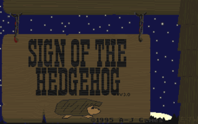
Sign of the Hedgehog (title)

Considering its origins, Sign of the Hedgehog turned out pretty well. From its title you may ascertain my thought process. For full clarity, though, let’s take a trip back to 1991.

From a very young age, I was obsessed with hedgehogs. Such it was that when, in the early ’90s, I read of Sega’s upcoming mascot game, I felt compelled to tell the world. No one would believe me. I was obsessed with the Sega Genesis, which was fine but at that time no one owned or played the system. I was obsessed with hedgehogs, but in mid-Maine in the pre-Sonic era no one had ever heard of them except in association with me. So clearly I had gone off the deep end and was just making things up now.
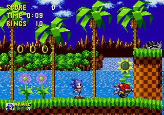
Sonic the Hedgehog

The game arrived, and it was very good, but — Sonic wasn’t really a hedgehog, was he. He didn’t look like a hedgehog, he didn’t move like a hedgehog, and he wasn’t really characterized the way you’d imagine. About the only parallels you can draw are that Sonic has spines and that he can roll into a ball. My mind got working.

Over the next couple of years, more Sonic games kept coming out to decreasing returns. Sure, each game had more stuff in it, but those were just things. The actual themes and spirit that made the first game so intriguing was being sidelined in favor of… stuff. It got so that Sonic the Hedgehog 3 was the last console game I bought or played until the Sega Dreamcast, another five years on. I was totally disenchanted with the direction that games were moving in.

Sonic the Hedgehog 3

And yet here I was in response, comporting more stuff into my own fetishistic ideas of propriety. I would draft my very own hedgehog game, the way that Sonic should have been. My hedgehog would of course be British, and as a Briton he would be enamored of all things tea. He would be reserved and conservatively dressed. As a hedgehog he would live in green places and only rarely stray out of his comfort zone. It would take a spectacular quest to shake him from his Hobbit-like indolence — something like a personal request from the Queen.

Hedrick

So we have a reluctant hedgehog with a tea obsession invited to see the Queen. What would motivate him to actually attend? Well, let’s make it tea with the Queen. What makes his journey an adventure? Maybe he needs to prepare for the visit. Let’s say he needs to bring supplies. What sorts of supplies? Goods for a tea party. So what goes with tea? If we’re being stereotypical, then crumpets.
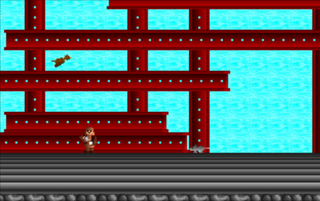
SotH screenshot

You can see the game taking shape here. Now we have a journey, and a scavenger hunt. Although there is a linear goal, this is a game about exploration and discovery rather than about speed (which is just as well for a hedgehog). Since it’s broadly linear but narrowly not, let’s scatter the levels around an overworld rather like Commander Keen‘s.
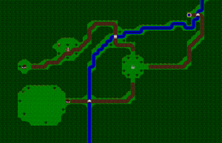
Overworld map

I’m not sure that this is very deep stuff, but at least the design concepts do come from the basic premise. If you squint, the game might even look a bit like satire regarding British conventions and the arbitrary decisions in mainstream game design. I don’t think any of that was deliberate. So far as I was aware, I made the game in earnest.

The game’s title is both a none-too-subtle nod to Sega’s game and a play on British public houses — or at least my adolescent concept of them.

In the end, Sign of the Hedgehog is more linear than I intended. You can thank those constant Game-Maker goblins of flags and counters. There was no easy way to prevent players from entering the same level over and over again to rack up provisions, which could only be a problem because Game-Maker will never reset special counters. Thus the player could keep collecting crumpets and 1-ups, dying, and then starting over to build up a wealth of currency and blow through the later levels.

Of course since the counters don’t reset this is a problem anyway, but at least making the level progression linear prevents players from abusing the system too terribly. In retrospect there are a few other unexplored solutions, but this is what we have.

The game was successful enough in my mind to warrant a sequel. I had promised one to registered users, and I figured that this time I would finally get a few orders. The orders never came, I got distracted by other projects, and the game never took shape.

Sign of the Hedgehog 2 (title)

To be precise, Sign of the Hedgehog 2 took a very general shape but I never bothered to whittle it down. As a result I have a slightly amended concept — this time Hedrick is collecting scones instead of crumpets; he now can toss crumpets like a Frisbee — and a new map screen, decorated with a poorly designed first level. To change things up, the map is now side-scrolling rather than an overhead view. You can tootle around the map all that you like, but there is nowhere to go.

One advantage to the side-scrolling map is that it does give a sense of scale and adventure. Compared to the bird’s eye view, you can judge how far Hedrick has traveled and what he went through to get there. I guess you could say it’s more subjective.

SotH2 screenshot

So far as I can tell, the one working level was more of a test than a real finished design. It consists of clear blocks against a night sky, presumably because I so enjoyed the clear blocks in the Commander Keen games. It was an easy visual effect, and it looked cool. Beyond that it had no purpose.

Already you can see my sensibility devolving, in several respects. But it would disintegrate much further.
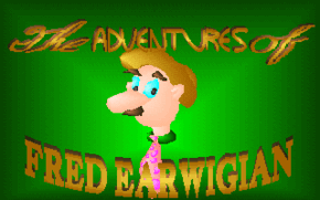
The Adventures of Fred Earwigian (title)

The Adventures of Fred Earwigian is the nadir of my character-based design process. By this point I had been hammering that character button for a couple of years, expecting my game concepts to magically present themselves at the last moment and allowing the full projects to take form. In this case, that didn’t happen. Why not? Well, let’s see.

Fred Earwigian was not so much a character as a wacky name. I have no memory of its origin; just that the name arose somewhere before high school, and thenceforth again whenever life called for a nom de guerre. Around my third year of high school, the name crossed paths with a domestic catch phrase and inanity was born.

On one return from Russia, my mother imparted a story of crossed communications. One of her hosts had advised her on departure not to forget, as she heard it, her hair. In reality he was speaking of a stuffed rabbit, a gift from one of her Russian friends. The misunderstanding delighted her enough to turn “Don’t forget your hair!” into a common goodbye in my household.

An arctic hare

By 1994, my well of ready ideas was dry. I began The Adventures of Fred Earwigian with nothing but the name, and eventually a title screen, expecting intuition to steamroll the rest into existence.

Based on the title graphic, I figured that Fred was rather slow — both physically and mentally. In physique and mannerisms, I envisioned him as a vaudevillian yokel with bits of Charlie Chaplin and Groucho Marx. In personality, my mind went to Steinbeck’s Lennie, from Of Mice and Men. I wasn’t trying to be obscure; these were honestly my cultural references as a teenager. I didn’t get out much.
Of Mice and Men

When one thinks of Lennie, one thinks of rabbits on the farm. When I thought of rabbits, I thought of Fred singing “Don’t fergetcha, don’t fergetcha hare / Ba-dum, ba-dum”.

That became the basis of my game: a bumbling, slow-moving, dim-witted fellow looking for a lost hare. I couldn’t make it work. I couldn’t find the game. I couldn’t find a point to it.

I drew and animated Fred’s sprite, and I recorded him some voice samples. I drew up half a dozen scenarios, none of which fit. The game was stalled.

Fred Earwigian sprite

I threw the character sprite and title screen together with a map and background tiles from one of RSD’s demo games, and uploaded the mess to the semi-official Game-Maker BBS in Rockport. With the files I included a document pitching Fred Earwigian as a design contest. Whoever made the best game out of the available materials would win something or other. No one bothered. Quite understandable.

You’d think that my experience with Fred Earwigian would have taught me something, but any wisdom was a good decade off yet. In the meanwhile I had mistakes to burn.

The story continues in Part Four

The History of A-J Games: Part One

  • Reading time:5 mins read

If you have played Builder, you may wonder about the developer name tacked onto the front. The answer is that Builder puts official close to an era that previously I had left dangling for about fifteen years.

Play it, really. It's kind of interesting.

When I was young, I expected to be a cartoonist. From 1988 to 1992 I wrote and drew a spectacularly unfunny comic strip called Andrew-Jonathan. Although there was no particular story or humor, there were plenty of characters – all with complex relationships, backgrounds, and personality quirks. The strip was also an outlet for themes absorbed from adventure movies, Tintin and Uncle Scrooge comics, and personal experiences.

A yuk a minute.

1988 was also the year that I began to design my first game, in the margins of homework assignments and in the back pages of notebooks. The game started as a clone of Konami’s The Goonies II — attic setting, inventory, and all. As the ideas developed and took on their own life, they absorbed elements of Hudson’s Adventure Island, Contra, and Super Mario Bros. 2. The cast of Andrew-Jonathan (in particular the title character) was also absorbed into the concept, almost from the start.

An influential game, in may ways.

This imaginary game began to trickle back into both the text and the metatext of the strip. The Crabby monsters (likely a subconscious influence from Super Mario 2) started to appear.

An influential game, in may ways.

The strip absorbed some of the game’s scenario, and the sort of violent 8-bit sense of cause and effect. Most curiously, whenever A-J’s friend Freeport was shown playing a videogame, it was a variant of that game –based on the strip and featuring those characters.

Never did implement those jumping things.

In a way, the strip’s four-year run was a build-up to and replacement for the game that I dreamed of playing. When in 1992 RSD’s Game-Maker presented itself, my attention shifted entirely from the comic. My first task on installing the software was to implement the game as directly as possible from my extensive plans. The result, I called A-J’s Quest. Barring the engine’s limitations and some improvisation along the way, the result was fairly close to my intentions – if a bit rough.

Watch out for them snappers.

The biggest diversions came from the limits on idle states, the odd key-mapping restrictions, the engine’s strange treatment of counters, and the lack of an on-screen display for hit points, items, and whatnot. I also envisioned the ability to equip and unequip weapons, as in many NES adventure games. None of these were big problems; I just adapted, and found more pragmatic implementations.

The generic inventory menu.

Soon after completing the game, I responded to a note in the Game-Maker box and mailed a copy off to Recreational Software Designs. They quickly responded with an unexpected call, then a long correspondence that would eventually lead me to produce gameware for Game-Maker 3.0. More immediately, they sent me the beta to an upcoming release of Game-Maker – one with provisional Sound Blaster support. In turn I went out and bought a sound card.

Blaster Master, a sound recorder for DOS.

The adjusted version of A-J’s Quest, now labeled 2.0, found its way into a demo for the 2.0 release of Game-Maker. It was also a feature of the short-lived Game-Maker Exchange program, where RSD compiled peer games onto floppies and sent them out to contributing users. But before I let loose my opus into the wider world, I decided to think up an official studio name. I didn’t think very hard.

Blaster Master, a sound recorder for DOS.

Now that I was a real game designer, I started to pour my energy into developing a more-of-the-same sequel. Its main gimmick would be multiple characters, each of whom followed an original path to the same goal. To prepare for this focus, I redrew the character sprite almost from scratch. In a short time I had learned much of pixel animation, and the previous sprite had started to bother me. The new sprite, I used as the basis for all four characters.

Aside from appearance the characters were only really distinguished by their vocal tics, which the new Sound Blaster support made possible. The levels were mostly recycled themes, using recycled tiles from the first game.

Wanna be a member? Wanna be a member?

A couple of years later, with a beta of Game-Maker 3.0 in hand, I set about making the biggest, most convoluted game possible with the tools. I meant to incorporate every possible character from the Andrew-Jonathan strip, each of whom would have distinct abilities and a different path through the game. The game would be a huge, branching adventure full of big decisions. For this event, I again tweaked the Andrew-Jonathan sprite with more detailed shading and more sympathy to Game-Maker’s quirks. In turn I added more variation to the other characters’ animations.

Simply titled A-J 3.

With my masterpiece in hand, I went back to revise the first two games and raise them to the level of A-J 3. I incorporated the second game’s much cleaner sprite into the first game. I adjusted most of the background tiles and some of the layout, added another level to A-J’s Quest, and smoothed over some awkward concepts. After all the tweaks, the first game wound up at version 4.0 and the second game wound up in pieces all over the hard drive. It was too much work to bring The Return of A-J up to snuff, and I had long overwritten its original format, so I was stuck with a dissected husk of a game. I figured if anyone actually registered the first game, then that would motivate me to put all the pieces back together. Neither happened.

Freeport takes to the clouds, for some reason.

Both the 4.0 and the 2.0 releases of A-J’s Quest achieved fairly wide distribution. The others, not so much. Whatever its form, for all its quirks and compromises, A-J’s Quest is probably one of the most familiar and influential games to come out of RSD’s tool set — and it became the cornerstone for about a decade of my creative life.

The story continues in Part Two

Sifting for Treasure

  • Reading time:5 mins read

When Yu Suzuki began his work on Shenmue, I doubt he any more understood what the game was going to be than I know what I’m going to eat for breakfast tomorrow. Sure, he had a plan — a plan for a Virtua Fighter-themed RPG. And when the game was finished, it had turned into a hands-on parable for the idea that life is what happens to you when you’re busy making other plans.

If, as they say, creativity is the tendency to make interesting mistakes, and if the best works are found in the editing, then intent becomes academic.

What, then, I find really interesting are those supernaturally clean concepts — statements so precise and frankly obvious that they surely must have burst from the aether of their own volition, without any human filter to muck them up. The truth is that, almost to the last, these are just the same shotgun ideas we all try to express, only edited to such a fine point that you feel you can use them as a weapon.

After a brief period of awe, I now understand Gradius V as one of these cases.

At the outset, I admit I was a little confused by how few choices the game seemed to present in comparison to past games. There is only one ship: the Vic Viper. There are four weapon modes, yet they all seem so similar; each has the same kind of a force field, all have the same laser, and what variable factors exist are much the same.

Later I saw that Treasure had merely brought the Options to the fore and center of the game mechanics, doing the uncanny obvious. With this one move, the game and indeed the whole concept of Gradius sticks as it never quite has and never would have otherwise. For the benefit of focus, away with the ripple laser and the photon torpedo and the classic Gradius shield, in favor of the Life Force model. Away with the checkpoint-respawning, again in favor of the Life Force system.*

Though — apparently not too far away. As insightful as the final game is, it looks like Treasure didn’t know any better than I what they were doing when they began. I say this because it seems they actually developed a bunch of that excess material which has so bogged down the series just for the sake of being there. When you beat the game — despite the difficulty level, I find it is more a when than an if — you are treated with a few of the details that Treasure apparently chose to leave out. Namely, a weapon select mode that includes a trove of abandoned concepts, largely inspired by past games.

As far as extras go, this one is about perfect; like a deleted scenes reel, only better. After the game knows the player has had the full experience, it eases up and returns all the toys that Treasure had taken away for fear of distraction, or even of undermining the whole game design. Even if it breaks the game, I finally get my ripple laser. I get a couple of neat missile types, which are far more useful (that is, easy to exploit) than the defaults. If I really want it, I can now use the old-style Gradius shield. I even have some wonky flavors of double shot, that I can combine with my Option type at will.

To me, this is neat precisely because I feel I have now earned the liberty to mess around. I’ve listened to what the game had to say. I’ve done what there is to do. Now we can let down our hair. It’s much the same strategy you see in fighting games like Capcom vs. SNK, where you to make want certain characters available, yet where those characters don’t really fit the main roster. So you lock them away, to make it clear that they’re just there for the fun of it; they’re not part of the actual design.

If I thought the game was brilliant before, I now also consider it generous. Particularly in regards to the insight it provides on Treasure’s creative process. It is a relief to see that they don’t just come up with these ideas; as with anyone, they have to just throw paint at the canvas, and see what sticks. Still, what editors they are!

A note: I see that Gradius V, as with Ikaruga, was designed and developed by only about half a dozen people. I think this says a lot for small teams. I wonder how the growth of team size corresponds to the way the medium has changed (and grown distracted) over the last decade. Something to think about.

* – If the game seems to draw from Life Force so much, I think there is a reason: Life Force is one of the only other games in the series to get certain key things right. Most of the other games in the series are so mired down in tradition and clutter that they become relics of broken-yet-cute ideas.

It Comes Down To This

  • Reading time:1 mins read

I just listened to the Sin and TPD singles again; I’ve not really listened to Trent Reznor in a few months. Whew — I’d almost forgotten how amazing a musician that man is. No wonder he spurred me into music. Just listening to PHM-era songs is akin to swimming in a river of inspiration and energy. His material is so ridiculously simple, yet impossibly effective, that all I can think when I hear a nin song is “I could do that,” and I really want to try, as well. I’ve strayed somewhat lately, but I guess I can’t help returning to nin as home base. . .

The contrast of nin and the Doors is great, as well — while Trent is all keyed-up and neurotically precise, as I am, Jim is all laid-back and more lenient, musically, while still not sparing any melodicism or rhythm. Then there’s Elfman, to amplify the inherent playfulness behind a lot of nin and Doors material.

It’s all fun. I’d forgotten about that. Music is fun.