SR388: A Spelunker’s Nightmare

  • Reading time:8 mins read

[ The following post is assembled from fragments of discussion from July 2014, October 2014, July 2016, and August 2017. ]

Long before that AM2R thing, which is exactly what a cynical observer would predict from a fan remake, I’ve often rambled about ways to do a sensitive update of Metroid II, that (unlike AM2R) honors the original game’s tone and thematic material and develops it even further, makes the game even more awkward and upsetting to play:

I still think the best way to tackle a remake is to consider the affect of the original, and try to recreate it. The original is claustrophobic, in part due to feeling lost — sameness, lack of a map — in part to the screen.

So, make light a scarce quantity. The world would be desaturated and have a big focus on environmental light sources — lava, certain bioluminescent plants or animals, Chozo technology. At times it’s hard to see anything. Sort of a Silent Hill aspect.

Samus’s suit may project a slight glow around her, reflecting on things. Generally the glow would extend about as far as the boundaries of the GB screen. Occasionally more or less. The glow from Samus’ suit would give things a sort of monotone hue. Maybe greenish, from her visor.

If you wanted to expand on the game, you could give her various kinds of light beam. Or make her suit glitch out. Maybe special heat and X-ray visors would be needed to navigate certain areas. Glitchily. It would be all grainy and prone to error. Make it go totally dark, for a scripted segment here or there, in the spirit of those segments where you have to blindly fumble around in ball form. Maybe you have to navigate by noise and touch. Maybe a sort of a sonar, so you can hear when the Metroids are getting close.

There might be an attempt at a map, but it doesn’t work right. Glitchy. Staticky. Suggests non-Euclidean space. Some key parts of the interior may not make any sort of euclidean geometric sense. They kind of don’t, already.

This would also play up some of the Zelda-style risk-and-reward progress limitation. You CAN go down there, but… should you?

Also see: Dragon Warrior, Phantasy Star II, Lost in Blue.

But, that’s if I were pressed to reinterpret the game. Insofar as its native form on the Game Boy, Metroid II is basically perfect. The worst I can say is that the control can get a little mushy at times. Speed up Samus’ movement by 125%, maybe tighten collision and response time. Little stuff like that.

Something I really dig about Metroid II is that as designed, it wouldn’t really make as much sense on another console. If you play through as an adult, with a modicum of design literacy in hand, it soon becomes clear to what extent the game actively uses its technical and conceptual limitations to say its own thing.

Unlike Super Metroid the world that it draws doesn’t feel like a playground set up for your benefit. It’s just there. If it’s confusing, then it would be, wouldn’t it. You’re invading this space that was never meant for a thing like you.

The game’s affect is just so subjective.The way the Spider Ball is used nails down how unfriendly the space is. This is a space where we really shouldn’t be, and it’s just by the skin of this overpowered miraculous thing that it works.

When you get to the cramped corridor forcing you to draw a visual parallel between Samus in ball form and the unhatched Metroid egg, there’s not a lot of space left (as it were) to question how expressive the design is meant to be.

It’s supposed to be claustrophobic. It’s meant to be disorienting and upsetting. You’re supposed to lose your way and freak out, the way you probably would in reality if you were dropped into an unmapped hole in the ground on an alien world. Or even ours. Even if mapped. It’s meant to be distressing, in no small part because you shouldn’t be there. The mission is wrong. You are playing the bad guy.

That’s not reading into it. In its closing moments the game tells you how you messed up, and Fusion‘s plot is based on this revelation. (Another irritating thing about Super Metroid is how it not only glosses over this failing; it compounds it. But Fusion gets the story back.) Fusion also gets the claustrophobia and tension back, in a shifted form, where Super throws them out in favor of Whee Shiny Perfect Action.

As far as how Metroid II uses the resources it has, the only thing I would treat differently is the lava. To quote one of many earlier discussions on the topic,

That goddamned lava. What is that? Of all the ways to limit progress. I mean… I can make up some silly theories that kind of work. But how arbitrary is that? At least it’s an apparent phenomenon of the gameworld, even if it’s triggered by discrete player-dependent flags.

Instead of progress clearly resulting from the player’s action it’s just, “What the hell was that rumble? Oh… there’s… a route here. Was it here before? I don’t think so.” Granted, it doesn’t affect me when I’m playing. It’s just in retrospect that it’s so incredibly clumsy and weird.

Of course the game is pretty linear, and it can’t let you miss a Metroid. If there were some narrative rationalization, maybe that would be enough. But then you’re in danger of needless exposition.

On reflection, I would add a horrible piercing screech after the extermination of each set of Metroids and before the earthquake and lava drain. Each time, as Samus strayed deeper into the caverns, the screech would get louder and longer, while the screen would shake with ramping violence. Toward the end, it basically would peak all of the sound output and leave the game a nauseating shaky-cam mess for minutes at a time.

This would serve many purposes.

  • It would make the game more disorienting and upsetting to play.
  • It would introduce the Queen early as Samus’s opponent.
  • It would establish the Queen’s growing pain and anger.
  • It would help to underline that maybe Samus isn’t quite doing the right thing here.
  • And it would resolve the structural weirdness around the lava, which as it stands is a VERY CONVENIENT and unexplained progress limiter.

All of this would be totally doable on the Game Boy. Pretty easy, even, in this engine. Everything’s already set up, pretty much. Just add a screech that gets louder and longer each time, and make the screen rumble longer and more violent each time. That’s all! But, it would make such a big difference to the game’s narrative flow, logical consistency, and thematic unity.

Would this change be on-the-nose, in terms of the game’s themes? Maybe. But done well, it wouldn’t be clear what was happening at first. It’d just add a layer of “huh?”, growing to “oh hell.”

Right now there’s little feedback to completing each wave, and the mild rumble has little impact, the lava drain nothing like an explanation. This would add at least a sense of intentionality to the design, which as designed leaves room for interpretation, yes, but also feels sloppy.

Significantly, all of the scream’s and the rumble’ thematic resonance becomes clear only in retrospect. You get ramping uncomfortable chaos as you burrow in, but aside from feeling increasingly intimidated, it’s only clear what’s happening when you finally meet the Queen, which snaps it all into focus.

Currently there is no clear moment of epiphany, and the Queen’s role consists of sitting there, unseen, until you burst in and kill her. The epiphany comes with the egg, which is great. Really great, actually. But its significance would be enhanced, coming out of the catharsis of that encounter with the thing that had been expressing pain the whole time. “Oh hell,” you’d think, “so that’s what has been happening all along. What… does all of this mean? What have I done?” And then, a baby Metroid imprints on you.

You’re still free to interpret however you like, but this gives a touch of emotional feedback and clarity to undermine any sense of bravado. And all it is is a screech and a more violent screen shake. That’s all it takes to snap it all into focus.

What’s in a name (e.g., Sonic Mania)?

  • Reading time:10 mins read

So, on Twitter, John Thyer pointed out a tweet suggesting that the new 2D Sonic the Hedgehog game, over which the Internet has obsessed for the last 12 months, is meant to be of the scale of STI’s (that initialism grows all the more pertinent with time) split 1994-ish opus, Sonic the Hedgehog 3 & Knuckles. This was an ambitious game that, as with many Sonic Team affiliated projects, didn’t meet its deadline, so was hurriedly completed — only to be patched with a second cartridge several months later, containing what was left of the original game plus a surplus of new “content” to justify selling a whole second cartridge. Lock the two cartridges together, and they merge into a monster platforming epic that overstays its welcome by about two-thirds yet that a certain demographic will nonetheless cite as the epitome of its form. It certainly is the epitome of something. I’ll give ’em that.

Anyway. I groused a bit that this claim was not a promising sign, which led to the predictable Twitter push-back. Though, the format of that push-back was a little strange. The claim there was, hang on, Sonic 3&K is the perfect length! It had fourteen whole levels! What, did I want it to be 20 levels more more? Was I nuts?

Uh. Well, uh. Hm.

Let’s dial back a bit, and redefine what we’re talking about.

[The following, I shall repeat directly from Twitter. Consequently, there will be a certain degree of ramble.]

Fourteen “levels” [more properly, Zones — which matters; see below] is, like, three times too many. Especially since half of them are terrible. Sonic 2 was already too long by 1/3 or so. The original Sonic the Hedgehog is just about the ideal length. You get a nice variety. You can explore and master every level. It doesn’t overstay. You can replay. The one thing I’d say against Sonic 1 is, we don’t need to iterate a zone’s concept three times before moving on. Do act 2, boss, move on.

It’s like. Compare.

How many times have you played a game of Tetris, versus how many times have you completed Final Fantasy X for fun? Any time I want to spend half an hour, I can play straight through Sonic 1, have a slightly different and complete experience. Sonic 3 & Knuckles? No way.

You know the best 2D Mario game? Super Mario Land. Lots of reasons why, but a really big draw? You can beat it in 20 minutes. I have never beaten Super Mario World, and I can assure you that it will never, ever, ever happen. There’s too much “content” for the experience. Super Mario Bros. 3 is pushing it, but at least it’s made to be pushed through at a sitting. It’s dynamic, momentum based. Keep moving, changing.

Memory cards, and to a lesser extent their battery-based predecessors, are possibly the worst thing ever to happen to console games. If you want to trace the downward trajectory of design versus rote content addiction, it begins here. We lost all focus once we could save our progress.

I abhor the mentality that we’ve all silently grown into that games are meant to be “finished” then put on the shelf and never played again. No rule is absolute, but that’s basically the point. Expansiveness isn’t linear progress; it’s an accessory to design that has specific uses. Does the nuance of Metal Gear Solid 3‘s discussion justify its length and complexity? Almost certainly yes. Does Sonic 3&K‘s? Probably not. What’s the point of scale when the game never uses that space to say anything novel, and half of the “content” is trash?

The issue at hand is context. For a game based so intrinsically on forward momentum, does it suit that remit to so sprawl? I’m not going to pretend that the roller coaster streamlining of Sonic 2 is ideal, compared to the more measured study of the original Sonic, but it shows what I mean. Underneath whatever variation of (the side scrolling iteration of) Sonic is this set of physics that demands the player to Get It Done; Keep Moving.

When the game gets in the way of Getting It Done, this is a pronounced conflict, best used to draw intentional dissonance with the player. When that dissonance is unguided or misguided, it gets in the way of the game’s essential grammar and message in an infuriating capacity.

This dissonance is a reason that so many people dismiss Sonic 1. No spin-dash! [The slow-moving] Marble Zone! You don’t just keep holding right all the time! Blah! This reaction, though, I submit is a result of a retrospective misreading of the game’s grammar and message, based on a priori assumption. The portions of Sonic the Hedgehog where you aren’t just holding right aren’t examples of broken or misguided design; they serve a purpose. They serve both to establish a broader sense of grammar, causality, and purpose and to underline the moments of speed with significance.

Without a low (or at least a medium), any highs are rendered meaningless. Over years of Pavlovian garbage, Gamers now expect nothing but high. Not only that; thanks to memory cards and decades of rote remakes, they expect lots of it, and never to have to repeat it quite verbatim. We’ll never play this level again, so let’s have twenty more that repeat its basic ideas, so we can say we’ve had our full. Then sequels! And of course we have to save our place, lest we lose our progress and have to play those tedious levels all over again! Heavens! We can’t possibly lose anything, or we’re being treated unfairly. We need more, more more. But — nothing too different, or because we only want this one specific thing.

After 20 years, okay, another major 2D Sonic is probably warranted. Good-O. It’s not like we’re talking a yearly EA franchise update. But. To do this demands that one go back and deconstruct the grammar and messaging: how does how the game say things affect what the game says?

Pac-Man CE is a brilliant deconstruction/refinement of the basic concepts of Pac-Man, cutting out the parts that distract from its message. Sonic 2 is not quite as brilliant, as it just abjectly chops out or papers over the portions of its predecessor that don’t involve zoom-zoom — which makes burn-out a real thing, as the dialogue is nothing but one-dimensional peak messaging for way, way too long. Holding right on a D-pad isn’t interesting in and of itself.

Sonic 3&K gets around this slightly by introducing much bigger levels with different kinds of blockades — so you have to press other buttons besides just right — then mixes its messages, creating a new type of unpleasant dissonance, by timing the maze. (Granted, the levels in Sonic 3 are more considered than the garbage in its content patch (Mushroom Hill can go pleasure itself fungally).)

Point being, if you’re gonna revisit a 25-year-old legacy, there’s a certain remit to plumb deep and try to rediscover its essence. To wit: Gradius V, which, oh my God, finally nails what makes Gradius what it is, and builds a whole game around exploring the consequences of that notion.

This Sonic Mania thing is full of fan service, which is fine, if you’re really into Moia, as it were. The announced scale gives me pause, though. Bigger ain’t better. It can be a neutral quality that supports a justified discussion. But, if it’s huge just to be huge… then, oh dear. When you combine this intended scale with the admitted glory of fan service that seems to make up the game’s fabric, it sounds worrisome.

What is the justification for the scale? What is it doing that demands the player keep trudging forward, saving progress, continuing later? Does it just serve to eat up the player’s time, so that it can put a number on the back of the hypothetical box next to play value? Because, and this is key to the whole relationship between a game and its player, I have a life. Being is time, you know. If something is going to eat up what precious life I have to give it, it had better have a reason. It had better give me some kind of insight, or at least unburdened joy, that makes me measurably better off than I was before I played it.

Each time I play Tetris, or even a short epic like Metroid II, I gain something. I’ve been down this road, but it’s a rich and subtle journey. The journey doesn’t demand so much from me that the burden of embarking it outweighs what fresh nuances it has to impart on a review. I come out rewarded.

A game like Sonic 3 & Knuckles asks that I give it measurably more than it has to offer me. It does give a me negative inspiration — “Don’t Do This” — but it’s not thoughtful enough to use its time effectively. It doesn’t really question its premises and bring them to a logical set of conclusions. There’s not much questioning going on at all, which is, I think, most of my point. The design here is less art; more a matter of rote craft and capitulation.

If the game were to use that space to dwell on the sort of progress that defines a Sonic game and give time for thought, well, okay then! Sonic Adventure justifies its scope for reasons similar to this. It goes to such lengths to dwell on the elements that make up the series. When you’re looking at the motivation that drives the characters and the way all of their perspectives interlock, this is heavy stuff. If there were more meaningful interplay amongst the characters in Sonic 3, and that interplay were reflected in its design, then okay. Scale.

Mind you, I’m not saying that “story” in and of itself is a necessary prerequisite. That’s just one example of a possible justification. If a game is to go deep in exploring the expressive and logical consequences of Sonic the Hedgehog‘s underling assumptions, then take the space you need. I’m not working on a faith that this is why the new game is to sprawl, though, precisely because of how Sonic 3&K is used as a reference point.

If you’re just going to go through the motions of iteration, keep the length to what that iteration can support without overly burdening me.

(And, this is why I can’t ever play videogames anymore. I take them way more seriously than is warranted.)

Addendum:

Incidentally, Sonic 3&K actually has 26 levels, not including special stages or multi-player stage. Ergo it is, to use the original power’s words, “tiresome and boring.” The original Sonic? It has 18 main levels, plus Final Zone [the final showdown area] and all of six special zones. By the poster’s standard (an ideal of 16 levels), it’s much closer to an ideal length! If we were to chop out those unnecessary third acts (which Scrap Brain bulks out by repeating a Labyrinth level), it’d be twelve, plus the special zones. Even better!

Sonic 2 has 20 main levels (plus a few extra in the mobile remake) — with, importantly for this discussion, far less variety. This is the poster’s litmus for too many, and exhaustion.

Sonic CD? If we take into account the past, present, future, and bad future variations of each stage, that gives us SEVENTY barely-differentiated levels. (You may well guess how much I enjoy Sonic CD. The answer lies not in the number alone, but the “barely-differentiated” plus the number.)

The Making and Unmaking of a Game-Maker Maker

  • Reading time:2 mins read

The decade between 1995 and 2005 was a dark time for the bedroom developer. With the introduction of the Web and the death of dial-up boards, the Shareware scene had crashed. With the introduction of 3D cards and the growing popularity of the home PC, development became complex and expensive. There was never a harder time for an amateur game designer to get started and build an audience.

That silent decade need not have happened. In 1991, a company called Recreational Software Designs released its own game design suite for MS-DOS. RSD’s Game-Maker supported VGA graphics, four-way scrolling, Sound Blaster music and effects, full-screen animations, large maps, and fully animated characters and monsters. Its editing tools were powerful and intuitive, allowing quick turnaround of sprites and background tiles and easy assembly into full games.

RSD ceased development just before the Web caught on, and right on the verge of a radical reinvention. The company never built an online presence, and Game-Maker failed to make much of an impression on the Web – leaving a big void for Mark Overmars to fill.

We caught up with lead programmer G. Andrew Stone, to talk about Game-Maker and the place that it holds in indie game history.

( Read the original post at Gamasutra )

Kenji Eno

  • Reading time:5 mins read

Man. This is making me feel a little weird.

If you’re reading this blog, you know how I am with videogames; this deep-seated ambivalence. I love what they can be, but I tend to hate what they are. There’s a small handful of designers out there who I think have the right ideas or the right attitude, that could actually make something of this form if people just listened to what they said.

One of the top tier is Kenji Eno. He retired in a huff about 13 years ago. Since then I doubt a month has gone by when I haven’t wondered if he’s going to ever design another game. Every few years he has threatened to, and he very nearly did something for the Wii. (EDIT: Looks like he actually followed through, on a smaller scale.) His final game, D2, is sometimes my favorite game for the Dreamcast, which is in turn my favorite game system and the last bastion of progressive design in the mainstream industry.

The man was avant-garde in an era when videogames never ever were. He couldn’t follow a straight formula if his life depended on it. He’d get bored and depressed at the suggestion, and then go make a sound-only game for blind people, or… something like this:

1UP: What can you tell us about Short Warp, the wild minigame collection you made for 3DO?

KE: This was the funkiest game!

1UP: And it even came packaged with a free condom. Were you trying to get gamers to have more sex? Because when we see used copies in stores, the condom is always unused and unopened.

KE: That’s sad. [Laughs] This game was made when I was almost on the edge. My mental status was getting very unbalanced, so I wanted to balance myself back by creating a game like this. I was thinking, “If I’m going to create a game like this, I should do something really crazy.” And that’s how I came up with the idea of this game, and that’s why I included a condom. However, I had to make it limited because the packaging was expensive because it came packed with a condom, so the physical dimensions of the package got thicker, and there weren’t any packages like that. So the manufacturing fee jumped up, and condoms weren’t cheap either, so it was expensive to manufacture the games. If I manufactured too many units, I was going to be deep in the red. So that’s why I limited the units.

1UP: How many units did you make?

KE: 10,000, and I hand-numbered all of the packages myself.

The man was an auteur and a rock star, and the game industry didn’t know what to do with him. After a certain point he got fed up with the scene and returned to his first calling, music.

He was only 42 when he died. Which means he was 29 when he retired from game design. He was 20 when he got his start with the sound design to a Famicom prot of Altered Beast. He was 25 when he delivered his breakout game, D. His entire career spanned just a decade, from scutwork through superstardom to sidelining and burnout. In amongst there he met and influenced and was influenced by the likes of Goichi Suda and Fumito Ueda. And he also pissed people off — not without good reason, or fair warning.

I was very mad at Sony. When I released D on the PlayStation, Acclaim was to publish it. So the sales people gathered orders for a 100,000 units, but Sony had given their other titles manufacturing priority. So Sony told me that they had only manufactured 40,000 units, and I was very mad about that . . . . So I was talking to a guy at Sony, and this was toward the end of the year, and I said, “OK, I’m going to go to [Japanese electronics retailer] Bic Camera, and if I don’t see my game there, I’m going to punch you.” and they said, “No don’t worry about it. It’s going to be there.” And I went to Bic Camera and didn’t find it, so I actually did punch this guy — so that should tell you how mad I was.

And so now he’s dead. And an era is passed. Be that as it may, surely his effort must have had some effect. Fifteen years and a couple of abysmal console launches later, surely the field is changed somewhat?

Well. Look at that; a new PlayStation.

Here’s the short version.

Yoshida: What do you mean, people aren’t buying game consoles? People still buy consoles. All we have to do is bring people games that they want to play, and they will buy our console. That doesn’t mean original or exclusive games, and we certainly don’t need new voices or intend to publish anything too outside the norm — but I am confident that the games that happen to materialize on our system will make people want to own it.

So okay. He probably wouldn’t have made another game on the scale of what came before. And if he did, it would have made only a small impact — and far too late to turn this ship around. You can’t fight entropy. Not with a hundred Enos. It’s foolish, really. Doesn’t mean you shouldn’t try, or hope.

It’s not his voice that I’ll miss; it’s the potential that he represented. It’s the fact that guys like Eno are out there in the world, and that just sometimes they have an effect — either directly or by proxy. And now there’s one fewer. And the world is poorer for it.

Thanks to Amandeep Jutla and Frank Cifaldi.

Air Fortress

  • Reading time:8 mins read

The Goodwill by my house is a well of pleasant surprises, from a $3.00 unopened, factory sealed copy of Torchwood: Children of Earth to a well-kept VHS copy of Dark Crystal. Yesterday on entering I noticed a glass cabinet by the register. The first thing that leapt at me was Spider-Man for the Sega Genesis. Decent game; I have the very similar Master System version. I don’t need it. Still, they had Genesis games! On closer inspection I also saw a stack of NES cartridges. The spines faced away, so I could only see the top game — some sort of top-down racer. The cashier was busy, so I waited.

On the way out I flagged down the lady and asked to flip through the games. The selection did not inspire me. there was a Wheel of Fortune game. There were two copies of another racing game. There were a couple of licensed games. And then at the very bottom, a well-worn rental copy of Air Fortress. That was it; though I had only played it in emulated snatches, I knew that I wanted to look deeper. The game was fairly obscure; it had a strange structure and mechanics; it was by eventual Nintendo second party Hal Labs. It’s just, when you’re flipping from one eccentric ROM to the next it’s hard to focus on any game for too long. Having the physical cartridge would give me an excuse to do so.

Air Fortress is a curious game, and obscure in more than one sense. Its director, designer, and programmer Hiroaki Suga didn’t seem to do much else. He ported the second Eggerland (or as we know it, Lolo) game from the MSX to the Famicom Disk System. (Later the first Lolo for the NES proper would compile the best levels from all of these earlier games into a single megamix for Western audiences.) He was in charge of New Ghostbusters II, and wrote music for a pinball game and a Game Boy version of Shanghai.

His game was released in severely limited quantities. The history of the NES being as opaque as it is, there are many conflicting version of the story — but according to one version Hal produced just 20 copies to sit alongside the NES test launch in 1985. In 1987 Hal pushed it out again for a larger official print run of 385 copies. As the story goes, people had to order the cartridge directly from Hal Labs — and in turn Hal would throw in a wall poster. Finally in 1989 the game entered regular production, and even was selected for a major Nintendo-sponsored game-playing competition — but its time was past and it never really gained traction or widespread recognition.

So check this out. The game is at least as old as Zelda and Metroid, and it feels like a postmodern indie retro game. It starts off with a Zelda-style story scroll that you’d swear was deliberately ripped off of that game but which was more likely parallel development. The character is named Hal Bailman because, well, Hal Labs and… Bailman? I don’t get that part. It’s a cool name, though.

The game has, for the time, an eccentric structure; it alternates between side-scrolling shooting segments and… well, not platformer areas. And it’s not quite action-adventure. Let’s just call it action-adventure platforming, though, to make the point and move on. During the shooter segments you bulk up on the game’s two kinds of power ups (of which we will speak more soon), then the adventure-platforming segments are where we see the real Hal-style contextual puzzle level design come into play.

The hesitation in that last paragraph comes from the game’s unusual mechanics; in the platformer sections Mr. Bailman has two main moves: shoot, and fly. He also can walk along the ground, slowly. The D-pad is used for all motion, and both buttons shoot. One shoots a standard projectile; the other shoots bombs. The effect of this control scheme is a little like the dual-stick, dual-trigger setup of modern first-person shooters — except minus a dimension.

There are two on-screen counters: one for energy, and one for bombs. These two counters correspond to the two power-ups. You can use the bombs at any time, and they can be replenished; they work sort of like the missiles in Metroid, except more so. Some things can only be destroyed with a bomb, and some things are better disposed of with one. Energy is an interesting thing, worthy of its own paragraph.

Energy serves two roles: not-dying, and fuel. Think of the way breath meters work in so many water levels, where a character’s life will drain to represent depleting oxygen — and often the less life the character has, the less breath available for submersion. Similar concept here, except we’re talking up instead of down. As you fly, your energy temporarily depletes — making you all the more vulnerable. As you sustain injury you lose freedom of motion, and you need to think harder about what you’re doing.

So there’s a minor juggling act. Next let’s add gravity and momentum, so the player needs to master the physics of the jet pack — all while avoiding injury and keeping an eye on fuel.

While we’re speaking of momentum, let’s conserve it — meaning recoil. When the character shoots, floating around or otherwise, he is repelled in the opposite direction. The game makes use of this property alongside everything else to construct clever, deliberate logistical problems. Say, you float down a well with spikes at the bottom and along the left wall. To move ahead you need fly below an underhang, just pixels above the tips of the spikes — yet that narrow passage is blocked by a robot sentry. If you shoot the sentry without thinking, chances are you will fly back into the spikes. If you lose control of your flight, chances are you’ll graze the bottom spikes. If you dawdle to think about it, chances are your fuel will run out.

So the levels are nice. The build-up of new concepts is very slow, and indeed there aren’t many to play with — but then the game keeps throwing in new loopholes. When you beat the first fortress and destroy the core, you continue a screen or two to the right and board your little, er, space scooter, which has somehow found its way to the exit. Presto; on to level two. When you beat the second fortress, the screen begins to blink and shake. After way too much time wandering you realize the place is going to blow up. There’s no countdown timer; you just have to intuit that things aren’t right, and bolt back to the entrance fast as you can. Otherwise, game over!

The game’s map designers had more storied careers than its director; the head one, Akio Hanyu, went on to program several of the Kirby games and the first two Smash Bros. games. The others worked on Sylvalion and the GBA e-Reader. (Remember that thing?)

Aesthetically the presentation is all over. The game looks bright, simple, and appealing, but hardly sophisticated. Then you look closer and you notice the backgrounds. What could be a flat color or repeating pattern, and in another game would be, will instead be a complex web of cross-hatching or dithering, the scratches getting denser toward the walls and more scattered in the center of a room. The character seems to have all of four frames of animation, but does he need much more? The same uninspiring music repeats through the whole game, or at least seems to; only the space opera bombast of the main theme really stands out.

Should you die, and you should, the game has a password continue — a short one; maybe only half a dozen characters. Considering its vintage (again possibly pre-Icarus), that’s novel stuff as well.

Air Fortress is a progressive game from an era when that didn’t make much sense. It trades spectacle for concept — and the kind of concept that only someone who designs games or has been playing them for long enough to look at them analytically (much longer than they had existed at the time it was made) would really notice or appreciate. It’s actually a very simple concept, that raises several questions about the assumptions that go into most design — and that works largely because of the game’s careful, didactic level design, that helps to illustrate how very simple the concept is yet how complex its ramifications can be at any given moment.

That concept? That you have a jetpack and a gun, and that every simple little thing you do has consequences. Physics and the energy system make sure of that. I mentioned how the controls bring to mind modern first-person shooters. The energy system calls to mind the “shield” innovation in Halo, and the attention to the physics of every motion is still fairly novel after twenty years.

As I play Air Fortress I think of Fishbane and Hero Core. This might well be their contemporary. The decisions here sort of make the game feel like a modern literate gamer’s idea of 8-bit design, with the benefit of a lifetime of hindsight and with the limited resources and attention span of most indie designers. It’s designed just far enough to make its point, play with its notions, and move along.

These days, that’s all I ask from a game — and it’s all I really have the patience to absorb.

The Principles of Game Design, #7

  • Reading time:1 mins read

There is no such thing as a bad mechanic; only a thoughtless application.

If you think that level grinding will serve an expressive purpose, or illustrate an important concept, then by all means work it in. If you’re just including it to slow down or impede the player, or because you see everyone else doing it, then maybe you should think a little harder about what you’re trying to accomplish.

Rules

  • Reading time:6 mins read

Recently I got some positive feedback to an old article for GameCareerGuide and Game Developer Magazine. The comment was from an instructor of game design, who appreciated the main point of the article: when possible, avoid wasted space.

The premise (and one of my basic assertions about design) is that deliberately or not, every component in a game communicates information to the player. The task of the designer is to pay attention to what and how the elements communicate, and to use those properties to communicate deliberately.

Ideally a game will instruct, inform, and illuminate its own premises with every beat of play — and ideally all of that will be invisible to the player. A game that fails to communicate deliberately will often misfire and lead the player down undesirable paths, or otherwise fail to explain itself to the player. Either result will tend to lead to a sense of manipulation or neglect, which in turn will lead to frustration and boredom.

In the article I singled out a very good game that due to its scale and ambition is not often prone to criticism. There are many of these games — imperfect, yet grand enough to be holy. Since they are holy, every part of them is beyond reproach. It’s the same problem with any medium, but gamers seem to get out less than other connoisseurs and from my experience often have less of a frame of reference.

The trouble with situations like this (that is, the golden calves) is that bad habits, unexamined, become codified. People repeat them by rote because that’s what they know. This poor grounding sets up a basic lack of discipline to design, which leads to further lapses in judgment, which only exacerbates the psychological detachment between the player and the design.

So although those original games may be solid, with just a few problem areas, a failure to illuminate those problems may be irresponsible by virtue of the games’ influence. That, to my mind, is one of the biggest failings of modern game design. If something generally works, the overwhelming tendency that I see (in the press, in the design community, and in the most obsessive audience) is to let the problems slide.

With videogames, blinders are almost a badge of honor. If you can’t overlook a few minor problems then you’re a casual player, which means that you don’t know what you’re talking about. Since videogames tend to be highly technical and specialized, only experts are qualified to comment on them. One of the worst insults for long-time gamers is to call someone a casual gamer, or a non-gamer. It’s like you’re either with them or against them. If you’re against them, then nothing that you say is of value.

The responses that my writing generates, then, tend to fall into two categories. In the first circle we have the game designers, the artists, the creative, and the analytical. In the second we’ve the gamers, the forum trolls, the obsessive, and the consumers. Broadly speaking, category A seems to appreciate my game writing. Category B does not.

The typical category B response contains any of a few common elements. Usually it’s angry, usually dismissive. The reader will focus on a passing error of fact — I counted the wrong number of stages or I didn’t know about a secret code — and ignore the actual argument. The user will complain that I failed to cite any sources, and insist that my arguments mean nothing unless I’m quoting someone else. Most often, the reader misconstrues the article in ways that I can neither predict nor understand. When I explain where they misread the piece, they tell me that I’m wrong and that what they interpreted was what I really meant.

As rude as it may sound, my experience shows that gamers tend to have real problems with reading comprehension.

My typical category A response contains none of these elements. The reader may have missed a shade of meaning, or failed to connect a couple of dots in my argument, but they get the general picture. If I clarify the point, they tend to accept it. They might offer a well-reasoned counter-argument. They express relief that someone has verbalized an issue that has bothered them. They express surprise that this is the first they have heard or thought about the issue, and vow to think about it further. Even if they don’t agree, they are interested in the arguments and they respond with civility.

By its nature, Group A is interested in how and why things work. It always wants to know how things could be better, more elegant, more eloquent — because its members themselves have a need to express themselves clearly. Group B is interested in how things are, and how they have been. The current consensus is the rule, and the only ideas that matter are those that reinforce that rule.

It’s a battle of principles versus facts, subjects versus objects. Both are, in a sense, rules — and rightly so, as videogames are all about rules. Again, though, it’s focus and priority. A principle says, “This is a good thing to be aware of.” A fact says, “This is true.”

Though they lend a practical weight, facts tend to shut down discussion. The only inherent meaning they hold is a record of what has been said before. When the thing that we’re talking about is a medium of communication, the most rational way to address it is in terms of pragmatic idealism: given the tools and limitations at hand, what’s the best way to say what you want to say?

Expressing ideas is difficult enough that outside of a deliberate exercise it would be irrational to close off any useful options or avenues of expression. When talk turns to videogames, however, that is a common response.

I have said before, with no small hyperbole, that the ideal game designer would never have played a game before. You can see why; in place of preconceptions, all they would have is conceptual problems and solutions. Likewise, I think the ideal game should be transparent to someone who has never seen a videogame. From my experience, I think that the people who matter generally agree. The gamers… not so much.

The eternal question is how to achieve this transparency without without sacrificing nuance or complexity. Hit the balance right, and the gamers won’t know the difference — but the new players will think you’re speaking just to them. This is the way that we keep the medium alive.

The best answer that I can give is to keep talking about it. So long as the wrong people keep telling you to shut up, you know you’re on the right track — and if the noise starts to blur the path a little, a little support from the right people can help to make it real again.

The Principles of Game Design, #6

  • Reading time:1 mins read

The worst thing a game can do is assume the player has nothing better to do than play a game.

If you’re not enriching the player’s life, you are stealing the player’s time and replacing it with emptiness. This is not only socially irresponsible; it has the side effect of burn-out. Eventually the player will notice how little he is getting from the medium, and will cease to participate.

Just assume that the player has a life that does not revolve around jumping through your hoops, and they won’t necessarily do everything you tell them to just because they’re holding a controller. If you’ve got something to say, figure out how brief and rich you can make it.

The Principles of Game Design, #5

  • Reading time:2 mins read

A valuable item doesn’t make things possible; it makes them easier.

Locks and keys are the clumsiest of obstacles, and they take many forms. If it is impossible to enter a dungeon without a wand that can burn the surrounding bushes, and the wand serves little purpose other than to permit the player access, then it is little but a key. A key holds no practical value; its value is symbolic of a current lack of hindrance — and in its subtext, it speaks to the player of helplessness in the face of an arbitrary and contrived world, built to impede the player rather than to provide opportunities to explore and learn.

The items that become treasures are those that expand the player’s horizons by allowing the player to transcend the routine and inhabit the world on a higher level. They don’t unlock basic functions so much as they provide a better way of doing things. Much as a good home appliance relieves a person from the burdens of daily maintenance, Link’s recorder relieves the player from having to continually walk familiar terrain. His magic key means no more worrying about keys. His wand means no more worrying about sword beams. Add the magic book, and no more fussing with candles either.

Perhaps the greatest treasure in a recent game, Gordon Freeman’s gravity gun makes everything in the world both tactile and potentially useful.

Unlike previous Gradius games, in Gradius V losing your power-ups is a setback rather than a death sentence. All it means is that you have to be more careful. Likewise gaining power-ups means that you can relax and better appreciate the game’s nuances, but beyond that insight the player misses nothing crucial by failing or refusing to upgrade.

There is a place for locked doors, both literal and functional — but think about why you’re using them.

The Principles of Game Design, #4

  • Reading time:1 mins read

Every piece of a game’s method must reflect the game’s object, unless that contrast is part of the game’s object.

A game’s method is defined as the manner in which a game conducts itself — the rules, actions, and objects that comprise play, and the way that they interact. A game’s object is the overall idea that the game serves to communicate. Whether or not the designer has considered the game’s message, by the act of playing the player will receive one.

Every action is a verb, and every object is a noun. The game tells a story by the manner in which every action happens to every object. Therefore everything that you ask the player to do, however minor, is a part of the message that you are communicating to the player. Taken as a whole, the most common behaviors over the course of play define the perspective that the game communicates to the player.

The Principles of Game Design, #3

  • Reading time:1 mins read

A videogame must communicate through game design alone, unless the information is incidental to the game’s object or method.

Avoid all exposition. If you can’t explain an idea through pure game design, then you need to rethink what you’re saying and why.

The Principles of Game Design, #2

  • Reading time:1 mins read

Every environmental cycle must introduce a new point of interest, unless the absence of that interest is part of the game’s object.

An environmental cycle is defined as a complete refresh of the player’s surroundings, be it one screen (in a 2D side-scroller) or the area between here and the middle distance (in a 3D game). The specific measurement differs from game to game according to its pacing, format, and spatial sense.

A point of interest is defined as a new concept, or a significant elaboration on a known concept. The concepts need not all be profound; they need only expand the player’s perspective on the game’s object or method.

The Principles of Game Design, #1

  • Reading time:1 mins read

A game must assume no prior knowledge, unless that act of knowing is part of the game’s object.

This principle extends to knowledge of prior game design, as well as to knowledge and experience beyond the medium. Of the two, the former is more of a fundamental problem.

The History of A-J Games: Part Three

  • Reading time:10 mins read

To catch up on the story to date, you can read the first two parts here and here.

So some of my characters, I spun out of existing projects. Others came about from that web of interests and in-jokes that brought about my Andrew-Jonathan strip in the first place. These characters are built of wholly abstract materials, which makes it all the harder to justify them in design terms.

It would be one thing to base a game on abstract concepts. That’s probably an ideal place to begin, actually; to take vague notions from life and to see how best to communicate those ideas through a framework of cause and effect. You only seldom see this approach; when you do, as in games like Passage or D2, or even Pac-Man, you end up with highly expressive, meaningful content.

Pac-Man

To base a game not on concepts, but things — well, you’re always starting on the wrong foot. This is why there are so few excellent licensed games, and why genres and long-standing series tend to devolve into meaningless variations on a form. It’s why tech demos, although fascinating on a level, make such empty and tawdry exercises.

This may be why so few developers have made real use of the Nintendo Wii. Nintendo boiled some brilliant and progressive concepts down to a thing, which developers proceeded to use as a thing rather than explore for the concepts that it represented.

Red Steel

So it’s hard enough to build a game out of an established character. Imagine if that character itself is uncertain. Instead of A-J Bear to draw from, with all his built-in thematic trappings and influences and continuity, you have the vague idea of a hedgehog who is very, very British. Offhand you can throw together a few lazy pitches, but what are you basing those pitches on? Cultural preconceptions? Handy iconography? Are you going to just stop there, or are you going to examine those preconceptions and break down that iconography into something practical and representational?

Think that’s easy? How about a game based on a funny name combined with a meaningless catch phrase? Whoever the character is, this is his name and these are the words that he spouts whenever possible.

Though I’m certain meaningful projects have begun with less material, some tasks were too much even for the slapdash methodology and low artistic standards of my youth.

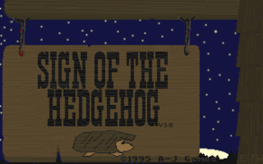
Sign of the Hedgehog (title)

Considering its origins, Sign of the Hedgehog turned out pretty well. From its title you may ascertain my thought process. For full clarity, though, let’s take a trip back to 1991.

From a very young age, I was obsessed with hedgehogs. Such it was that when, in the early ’90s, I read of Sega’s upcoming mascot game, I felt compelled to tell the world. No one would believe me. I was obsessed with the Sega Genesis, which was fine but at that time no one owned or played the system. I was obsessed with hedgehogs, but in mid-Maine in the pre-Sonic era no one had ever heard of them except in association with me. So clearly I had gone off the deep end and was just making things up now.

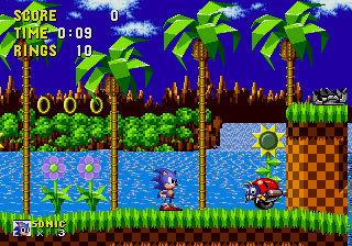
Sonic the Hedgehog

The game arrived, and it was very good, but — Sonic wasn’t really a hedgehog, was he. He didn’t look like a hedgehog, he didn’t move like a hedgehog, and he wasn’t really characterized the way you’d imagine. About the only parallels you can draw are that Sonic has spines and that he can roll into a ball. My mind got working.

Over the next couple of years, more Sonic games kept coming out to decreasing returns. Sure, each game had more stuff in it, but those were just things. The actual themes and spirit that made the first game so intriguing was being sidelined in favor of… stuff. It got so that Sonic the Hedgehog 3 was the last console game I bought or played until the Sega Dreamcast, another five years on. I was totally disenchanted with the direction that games were moving in.

Sonic the Hedgehog 3

And yet here I was in response, comporting more stuff into my own fetishistic ideas of propriety. I would draft my very own hedgehog game, the way that Sonic should have been. My hedgehog would of course be British, and as a Briton he would be enamored of all things tea. He would be reserved and conservatively dressed. As a hedgehog he would live in green places and only rarely stray out of his comfort zone. It would take a spectacular quest to shake him from his Hobbit-like indolence — something like a personal request from the Queen.

Hedrick

So we have a reluctant hedgehog with a tea obsession invited to see the Queen. What would motivate him to actually attend? Well, let’s make it tea with the Queen. What makes his journey an adventure? Maybe he needs to prepare for the visit. Let’s say he needs to bring supplies. What sorts of supplies? Goods for a tea party. So what goes with tea? If we’re being stereotypical, then crumpets.

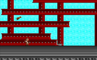
SotH screenshot

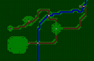
You can see the game taking shape here. Now we have a journey, and a scavenger hunt. Although there is a linear goal, this is a game about exploration and discovery rather than about speed (which is just as well for a hedgehog). Since it’s broadly linear but narrowly not, let’s scatter the levels around an overworld rather like Commander Keen‘s.

Overworld map

I’m not sure that this is very deep stuff, but at least the design concepts do come from the basic premise. If you squint, the game might even look a bit like satire regarding British conventions and the arbitrary decisions in mainstream game design. I don’t think any of that was deliberate. So far as I was aware, I made the game in earnest.

The game’s title is both a none-too-subtle nod to Sega’s game and a play on British public houses — or at least my adolescent concept of them.

In the end, Sign of the Hedgehog is more linear than I intended. You can thank those constant Game-Maker goblins of flags and counters. There was no easy way to prevent players from entering the same level over and over again to rack up provisions, which could only be a problem because Game-Maker will never reset special counters. Thus the player could keep collecting crumpets and 1-ups, dying, and then starting over to build up a wealth of currency and blow through the later levels.

Of course since the counters don’t reset this is a problem anyway, but at least making the level progression linear prevents players from abusing the system too terribly. In retrospect there are a few other unexplored solutions, but this is what we have.

The game was successful enough in my mind to warrant a sequel. I had promised one to registered users, and I figured that this time I would finally get a few orders. The orders never came, I got distracted by other projects, and the game never took shape.

Sign of the Hedgehog 2 (title)

To be precise, Sign of the Hedgehog 2 took a very general shape but I never bothered to whittle it down. As a result I have a slightly amended concept — this time Hedrick is collecting scones instead of crumpets; he now can toss crumpets like a Frisbee — and a new map screen, decorated with a poorly designed first level. To change things up, the map is now side-scrolling rather than an overhead view. You can tootle around the map all that you like, but there is nowhere to go.

One advantage to the side-scrolling map is that it does give a sense of scale and adventure. Compared to the bird’s eye view, you can judge how far Hedrick has traveled and what he went through to get there. I guess you could say it’s more subjective.

SotH2 screenshot

So far as I can tell, the one working level was more of a test than a real finished design. It consists of clear blocks against a night sky, presumably because I so enjoyed the clear blocks in the Commander Keen games. It was an easy visual effect, and it looked cool. Beyond that it had no purpose.

Already you can see my sensibility devolving, in several respects. But it would disintegrate much further.

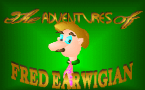
The Adventures of Fred Earwigian (title)

The Adventures of Fred Earwigian is the nadir of my character-based design process. By this point I had been hammering that character button for a couple of years, expecting my game concepts to magically present themselves at the last moment and allowing the full projects to take form. In this case, that didn’t happen. Why not? Well, let’s see.

Fred Earwigian was not so much a character as a wacky name. I have no memory of its origin; just that the name arose somewhere before high school, and thenceforth again whenever life called for a nom de guerre. Around my third year of high school, the name crossed paths with a domestic catch phrase and inanity was born.

On one return from Russia, my mother imparted a story of crossed communications. One of her hosts had advised her on departure not to forget, as she heard it, her hair. In reality he was speaking of a stuffed rabbit, a gift from one of her Russian friends. The misunderstanding delighted her enough to turn “Don’t forget your hair!” into a common goodbye in my household.

An arctic hare

By 1994, my well of ready ideas was dry. I began The Adventures of Fred Earwigian with nothing but the name, and eventually a title screen, expecting intuition to steamroll the rest into existence.

Based on the title graphic, I figured that Fred was rather slow — both physically and mentally. In physique and mannerisms, I envisioned him as a vaudevillian yokel with bits of Charlie Chaplin and Groucho Marx. In personality, my mind went to Steinbeck’s Lennie, from Of Mice and Men. I wasn’t trying to be obscure; these were honestly my cultural references as a teenager. I didn’t get out much.

Of Mice and Men

When one thinks of Lennie, one thinks of rabbits on the farm. When I thought of rabbits, I thought of Fred singing “Don’t fergetcha, don’t fergetcha hare / Ba-dum, ba-dum”.

That became the basis of my game: a bumbling, slow-moving, dim-witted fellow looking for a lost hare. I couldn’t make it work. I couldn’t find the game. I couldn’t find a point to it.

I drew and animated Fred’s sprite, and I recorded him some voice samples. I drew up half a dozen scenarios, none of which fit. The game was stalled.

Fred Earwigian sprite

I threw the character sprite and title screen together with a map and background tiles from one of RSD’s demo games, and uploaded the mess to the semi-official Game-Maker BBS in Rockport. With the files I included a document pitching Fred Earwigian as a design contest. Whoever made the best game out of the available materials would win something or other. No one bothered. Quite understandable.

You’d think that my experience with Fred Earwigian would have taught me something, but any wisdom was a good decade off yet. In the meanwhile I had mistakes to burn.

The story continues in Part Four

The History of A-J Games: Part Two

  • Reading time:7 mins read

To catch up on the story to date, you can read part one here.

The bulk of my Game-Maker career involved a backwards design process whereby I would think up a character, then write a story, then decide how to incorporate it all into a game. I built levels with little thought to the characters’ abilities or the game’s broader themes. I had that amateur notion that games were a battle of wills between the player and designer, so my games tended to be unfairly difficult. It was a mess.

Further confusing the issue was my process for choosing my characters. Life with my parents was like tap dancing in a mine field. Most of my energy was devoted to avoiding random triggers, which amounted to a sort of high-stakes guessing game. To keep in good graces, and thereby to be left to my ways, it was wise to run my activities past my mother and to leak details very slowly.

I recall that all of my pitches involved specific things, facts, that I thought would distract her. If nothing went click, and those gears failed to turn, it was safe to progress. Once, scrambling for an idea, I suggested a bear riding on a seahorse. I think that got a pass, but I couldn’t figure out how to spin a game out of it.

I had spun my first game from my comic, Andrew-Jonathan; that had been a success, both creatively and domestically, so for a while I kept returning to that mine. There was certainly enough to draw from. The world of my strip barely touched the page. It spanned a junkyard of irrelevant whimsies, from Easter toys to Apple Jacks prizes, wound together with half-remembered snatches of Susan Cooper novels.

One of the larger recurring themes is Cousin Zoom, a timid librarian with a prophetic name. For reasons unclear, Andrew-Jonathan’s grandfather is a wizard. Some wires crossed, his cousin found himself in the wrong place at the right time, and that cousin became a superhero.

Although Zoom gets the disguise right — he not only drops the Clark Kent spectacles; he dons a Zorro style mask — he keeps the same name in both guises. He also becomes a hazard to friend and foe alike.

Inspired by Taito’s Superman arcade game, I chose to do something a little different with RSD’s engine. I alternated side-scrolling action levels with overhead shooting segments, and I ramped the difficulty way down to make the game accessible.

The lower difficulty worked together with some new concepts to gloss over some of my earlier awkwardness. Flight removed the logical problems of platform mechanics, and a bulky sprite with full player control improved collision in the shooter levels. The engine was still awkward, but the game worked within its box.

Zoom cohered well enough that people seemed to actually play it. Although I have no metric, it looks like the most widely distributed of my games. Often listings would describe it as a children’s game, presumably because of the bear. That always confused me, as even with its lowered difficulty the game is still pretty tough.

Around the turn of the millennium Zoom turned up on a few major download sites. I recall that ZDnet gave it three stars out of five, which although unremarkable made me rather proud. By that point the game was five years old, running in a weird engine, and far from my best work — but someone who reviewed this stuff for a living still found it adequate. So, hey.

Some of the spin-offs are less obvious. Ralph, for instance, only made a single bizarre appearance in the comic, and in the game his backstory is very different to what I imagined elsewhere.

Ralph is an orphaned chicken-duck who dallies as a consulting detective. What complicates this task is that the only word he seems to speak is his own name. For the game I transplanted him to a world where all life forms are powered by precious green crystals, and gave him a range of surreal terrain to navigate in his search for a portal to Earth. Since Ralph was a detective, the mechanics were based around searching for objects and using a magnifying glass to focus beams of light at enemies.

Of all my Game-Maker games, Fluffy Ralph is probably closest to RSD’s intended use for its game engine. It’s a top-down, vaguely Zelda-like action adventure. There’s nothing complicated or subversive in the mechanics. Ralph was just a simple game to develop. I even borrowed many of the graphical elements from Zoom. Perhaps this lack of a struggle shows in the design, as compared to some of my other games very little feels out-of-place.

I’m unsure how far the game traveled, but I have received comments. It seems that people remember Fluffy Ralph, and remember it favorably. As usual the later levels become needlessly difficult, but presumably only a few have known that torment.

This next spin-off is a little harder to explain. Remember Wacky WallWalkers? I used to collect the things. To prevent them from drying out, I would preserve them in clear film canisters filled with dishwashing liquid. Somehow this turned into a running joke.

They were never exactly characters in the comic; more like a recurring concept. Yet I always felt empathy for the WallWalkers. They seemed sincere, with their huge eyes and startled expressions. The film tubes weren’t just a grotesquerie; I wanted to protect the Walkers from decay. This, I suppose, plays into the scenario of Octolris.

The game describes the titular hero as the last of the slime octopi; to avoid becoming soup, he embarks on a treacherous journey back to the sea. The levels he navigates make very little sense. He travels from an ambiguous green and purple area to the seashore, then to a disco. Between standard levels, Octolris explores tight mazes — storm drains, air ducts, plumbing.

The character can walk, leap in three directions, and climb up or down certain walls. The mechanics here are sort of unusual. Jumping is an all-or-nothing thing; when you press the key, you travel in a specific arc and land in a specific place. I wanted to address the weirdness of jumping in earlier games like A-J’s Quest, which encourages the player to spam the controls in order to glitch into higher and farther jumps. The mechanic works well; it’s just that I often fail to account for it in the level design, which makes some areas harder than necessary.

The other oddity is the wall-climbing. To reflect the way that Wacky WallWalkers lose their stickiness and slowly dry out, I chose to mete out the octopus slime. One problem with this idea is that, guess what, I failed to account for it in the level design — so if you run out of slime, you’re stuck. There is no other way to complete most levels. The other problem is that Game-Maker does not provide a display for special counters, and so the player has no way of understanding how much slime is left. I got around these problems by overwhelming the player with slime refills. Instead I should have just ditched the limit.

If you will, Octolris seemed to have more legs than many of my games. I see it pop up here and there, and I have gotten some positive feedback.

Despite their origins, all of these games pulled together fairly well — at least, by my standards of the time. Their designs did reflect key aspects of their concepts, and those concepts served to humanize the mechanics.

Probably their greatest asset is the shared background. Although by necessity I entered the design process through the wrong door, I had already thought about the characters and scenarios enough that there was at least a sense that I knew what I was doing. The result is that the games are a little more holistic than by rights they should be. The result of that is that they stick in the mind a little, and that people seem to have reacted fairly well.

The story continues in Part Three