I want to reach up/and touch the sky…
Now that I have a TV again, and now that I’ve retrieved my copy, I’ve been spending most of my time with Taito’s Graffiti Kingdom (the successor to Magic Pengel, if you’re more familiar with that). Why this game wasn’t developed for the DS, I don’t know; if there’s a third entry in the series, it had better be a DS game. Heck, the development team had better make a DS iteration, whether they intended to continue the series or not.
The deal is, you draw your own characters in 3D, and guide their animation. For simplicity, the program figures out how to animate on ts own; you mostly help to narrow its guesses. That’s actually kind of neat, though, as you’ll find your characters do all manner of things you wouldn’t have been creative enough to have devised on your own. As you play, you learn new abilities — both on the drawing and the animation ends. For instance, you might learn how to paint on your models, or to define a segment of your model as a wheel. You start with almost nothing, and are constantly fed a stream of new commands, at about the right rate to learn them all as they come.
As a videogame, it’s no great shakes. The levels are strung together to give you something to do with your characters, and the monsters mostly serve to suggest ideas for future drawings. The level design has a little thought put into it, in that it’s paced to feed you new situations at the rate you gain new abilities. There’s a story, though there’s no need for one. It would be easy to dismiss altogether were it not for the horrendous localization. I watched and listened, and I swear the emphasis, intonation, or timing of every spoken line in the game is off. Rarely is it even in the general dimension intended by the script. Which is not to imply the script is any better.
The localization problems, unfortunately, also extend to the painting and animation controls. The names given to functions and abilities are often misleading, and sometimes unintelligible. There is a little descriptive window whenever you select a function; its descriptions, such as they are, only further the frustration.
Despite all of this, it’s engaging as all hell. According to my in-game timer I’ve spent six hours in the game; the timer only records playtime. This is an unwise decision, as I have probably spent three times that drawing and animating, rather than playing. Were the game itself worth bothering with, Taito would have something downright dangerous at hand.
I should mention that although I have not played Magic Pengel, this is apparently a great expanion from that game. Pengel‘s drawing tools were comparably primitive, and pretty much all you could do with your characters was put them in a rock-paper-scissors match against other monsters. Imagine if, in the third game, you were able to do your own level design. Just draw a map, then refine the way the game fills in the blanks for you. Populate your maps with monsters of your own design. Then pack your level up and transmit it over wi-fi to other users, to play through with their own characters.
See, that’s what the game does — it inspires. Both in its good and its bad, it gets the mind churning. Any time that happens, it’s worth bringing attention to.
On that note, here’s what I’ve been up to lately:
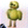


From left to right, these are my four creations to date (in order of their device): Çirpy, Sashanaut, Krorn Jones, and Yoonie. The last is Shep’s character, Rælf. Which reminds me: this game takes up a hell of a lot of space. You’ll want a separate card for it, if you regularly play any other PS2 games.
And here follows some illustration of how they look and work:

My first-hatched, subconsciously perhaps based on an old character of mine (other medium, other lifetime) named Fluffy Ralf. Today I revised his legs to improve his walking animation. For a while I gave him a stupidly long bo staff to attack with; it clipped so badly when Çirpy slung it over his shoulder, I just had to remove it. So now Çirpy’s a close-quarters fighter, with a jump-back move after every two-hit combo. His feathers flop all over as he moves.


Yes, it’s based on my cat. Roughly. Sasha’s wings are nowhere near this fluffy. And he looks less like a toaster struedel. He does taste of strawberries, though. Never did figure that out. See his moves here and here! Sashanaut’s, I mean.


My fourth, and most advanced yet. He’s not perfect; I’ve no way to put his feet on the pedals, and there’s clipping all over. I’m kind of proud of how he’s come out. He started as just an experiment with a wheeled instrument, about fifteen minutes before I actually earned the “wheel” designation. Instead, I just used rotating pieces. It seemed silly to just have a unicycle on its own, so I put a bear on it. The bear would have looked bored just sitting there, so I gave him a book to read. That eventually turned into a magic book, with flame properties. I’m getting better with the drawing tools, I think; his profile in particular is distinctive. Note that his legs are specified as arms; otherwise, he’d just stand up and run around with a unicycle sticking out of his butt.


And this is how they look in a bowling alley.
Yes, I realize Yoonie’s footage uncannily resembles that of a lake beast of certain repute. I assure you, the coincidence is entirely coincidendal.


Krorn Jones was another experiment. I didn’t expect to keep him around for more than a few minutes; it’s just, with his long arms, his backflip ability, and his firearms, he turned out as my most powerful character — and he’s got some personality, for a robot. I just recently added some moving gears and decorations, since I decided he’s staying around.
That’s it for now!

